With 2X higher user engagement on tablets, Zoom optimized for large screens on Android
Posted by Maru Ahues Bouza, Director, Android Developer Relations Zoom is an all-in-one collaboration platform. Whether supporting work streams through video, chat, or the platform’s smart recordings and whiteboard tools, the team at Zoom aims to simplify personal and professional communications. For Zoom engineers, creating the best experience for users means meeting them where they are across a variety of devices with unique form factors. Currently, there are more than 270 million large screens and foldables in use across the Android ecosystem. With this in mind, the Zoom team saw an opportunity to boost the app’s support across the Android ecosystem, helping to ensure a seamless user experience on any supported device. Zoom users spend more time on large screens In the last few years, the Zoom team has seen increased tablet usage among its user base. The Zoom team has seen increased tablet usage among its user base, and people who use Zoom on both their phone and tablet spen
 Posted by Maru Ahues Bouza, Director, Android Developer Relations
Zoom is an all-in-one collaboration platform. Whether supporting work streams through video, chat, or the platform’s smart recordings and whiteboard tools, the team at Zoom aims to simplify personal and professional communications.
For Zoom engineers, creating the best experience for users means meeting them where they are across a variety of devices with unique form factors. Currently, there are more than 270 million large screens and foldables in use across the Android ecosystem. With this in mind, the Zoom team saw an opportunity to boost the app’s support across the Android ecosystem, helping to ensure a seamless user experience on any supported device.
Zoom users spend more time on large screens
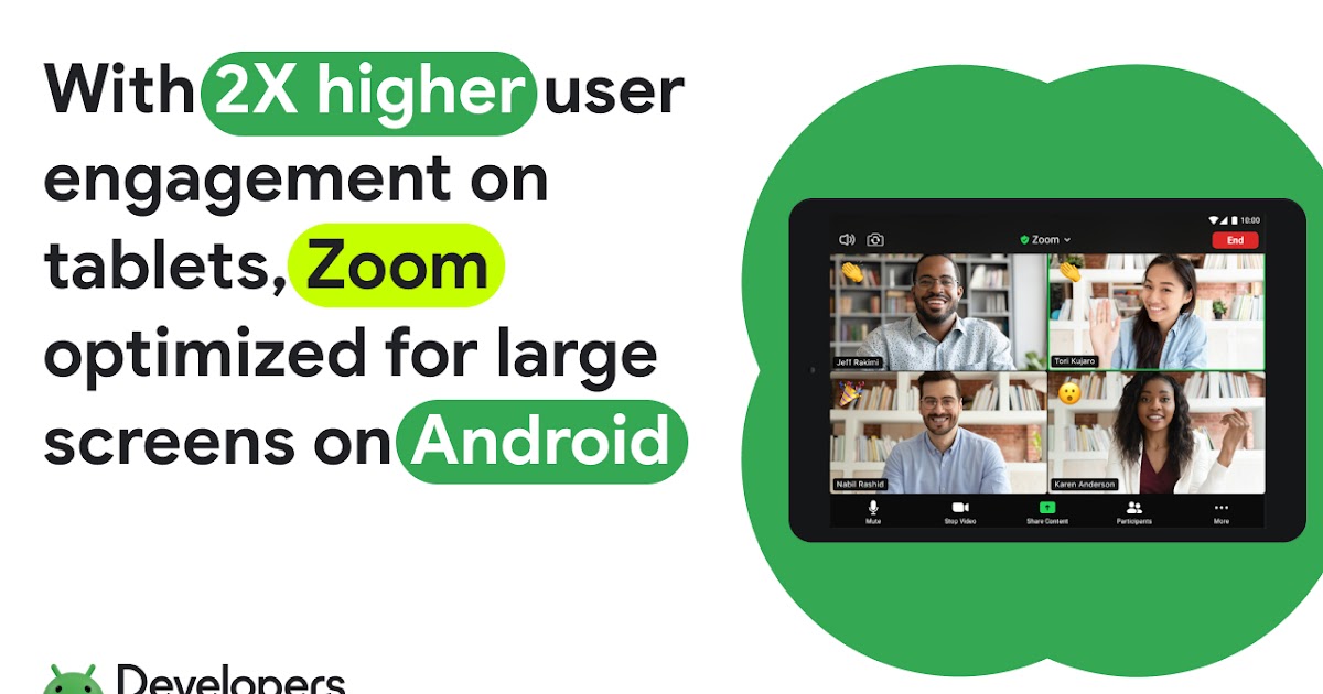
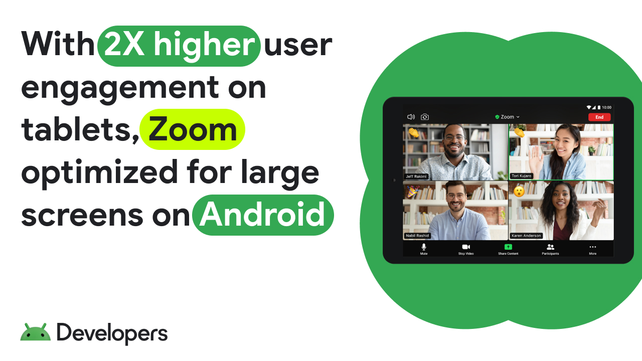
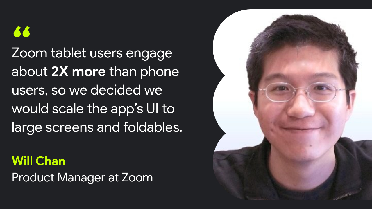
In the last few years, the Zoom team has seen increased tablet usage among its user base. The Zoom team has seen increased tablet usage among its user base, and people who use Zoom on both their phone and tablet spend about 62% more time on their tablet. In addition, Zoom tablet users engaged about 2X more via Zoom than phone users.
Zoom engineers wanted to give users on large screens the same experience on their preferred devices as those using the app on a smartphone or computer.
“We wanted to make sure large screen users have the best experience possible when using Zoom,” said Will Chan, a product manager at Zoom. “Ensuring we could scale our mobile UI to address our user needs — regardless of their device size — was important, whether it's phones, foldables, or tablets.”
Improving multi-window support on foldables
Zoom engineers started by using the Jetpack WindowManager library, which provides developers all the resources they need to start optimizing across form factors. Using the library, Zoom engineers made the app’s tabletop UI for foldables more efficient by placing videos on the top screen and moving any controls to the bottom screen. This gave users a more hands-free experience, making it easier for them to use the app with their foldable devices.
For foldables, Zoom engineers also optimized the app’s Team Chat. After overhauling this feature, Zoom’s Team Chat worked seamlessly in split-screen mode. When in portrait mode, the app would now show a chat preview on the left side of the screen and the chat details on the right. Small changes like this make better use of on-screen space so that users can more easily manage the tasks at hand.
Adding more features can lead to greater complexity. To avoid complicating the app’s UI on foldables, Zoom engineers used ConstraintLayouts. These help simplify the app’s interface, reducing a lot of the complexity that comes with creating multiple layouts on a device. As a bonus, ConstraintLayouts also improve the app’s performance while switching between layouts, improving useability overall for users.
Making the most of larger screens
Large screen devices give users considerably more onscreen real estate to work with. And with so much available space on these form factors, Zoom engineers wanted to up the app’s multi-window support by allowing users to go into picture-in-picture mode. Just as with optimizing for split-screen modes on foldables, picture-in-picture allows users to better multitask while they’re in meetings or taking a phone call.
Zoom engineers also tweaked the app’s UI to scale accordingly when large screen users resized their windows. To do this, the Zoom team used the resizeable emulator in Android studios. Together, these tools let the engineering team preview how the new experiences would look across many different devices, allowing developers to test their optimization before putting it into production.
“Resizable emulators and Android Studios made testing and developing a lot easier, ensuring the user experience is great on multiple large screen devices,” said Will.

Easy optimization across Android
The suite of tools and resources provided by Android made it easier than ever for Zoom engineers to improve its app across form factors. Considering there are so many users on large screens and foldable devices today, Zoom developers were glad that they could create a more cohesive UX without having to exhaust all their resources.
The Zoom team is excited by the global reach of the Android platform and looks forward to seeing what Android will add to its already-large pool of developer resources and tools.
“Our engineering team appreciates all the investments being made in the Jetpack libraries. It’s made their lives much easier while developing for Android,” said Will.
Get started
Learn how you can optimize your app for large screens and foldables.
What's Your Reaction?


